Friday, April 15, 2011

Stereotypes


It took me about five days to create this piece with the medium of Prismacolor; the dimensions of this piece are 12 inches by 12 inches. I am very happy with this composition because of the way I demonstrated the style of Audrey Flack and because of the color choices. The way I made the perfume bottles look like glass and the color harmony are my favorite things about this composition. Especially the purple accent line because it allows the audience to see that perfume bottle in the center is infact glass and it is also the opposite of orange on the color wheel so they naturally go together. I also like how the pearls and the perfume bottle on the left turned out. All in all I am very proud of all of the elements of this piece. I struggled with the mirror on the right of the compostion because the orange square is so loud that it took away from the rest of the compostion and I had issues trying to make it stand out less. The flower in the center of the mirror was took a lot of time because of the shading and the details were small. I was also worried about the advertisement in the background that says "Meet me in Paris". I did not want to draw in all of the details because I was afraid it would take away from the rest of the picture so we decided to leave it alone. I hope y'all like it and that it doesn't sound like I'm just talking about how great it is. Now the title, I decided to call this "Stereotypes" because all of these things are considered to be owned by women: a mirror with a flower on it, perfume and pearls. And I guess the title makes you think about what I'm trying to say about stereotypes, and that is don't define other people by their possesions even if it's as simple as a perfume bottle.

Saturday, April 2, 2011

Babushka


This is good. You know what that is? Good. This painting is 12 inches by 18 inches and we were following the style of Derek Gores. The criteria was to create a portrait, animal or an object through collage. I chose make a collage of the actress that plays Anna Karenina from the novel Anna Karenina by Leo Tolstoy. I did so because the novel is based on 1870s Russia, therefore she reflects traditional style which corresponds with my theme. I feel that the best part about my painting is the black fur and the skin tones of the face. The black fur is interesting because it features text which not only functions as snow particles but it also reflects the style of Derek Gores. Also the texture of the fur is interesting, even though it was time consuming I like how it turned out. It turned out well because the texture of it is seen from far away. The skin tones are also a good part of my collage I did not just take large sections of skin from magazines, I complied a number of different sections of skin tones to create it. So the black fur and the skin tones make this collage look original. I struggled with making the features of the face, such as matching the eyes, or creating shadow with the nose. All in all this collage was a success and I am proud to call it mine. I called it "Babushka" because it means Grandmother in Russian, and my grandmother's name is also so Anna and I saw it fit.

A Depiction of Spike


The criteria of this project was to create a portrait and I did not want to do a self portrait because I thought that would not be original so I chose my dog instead. This artwork was done in about five days and for the first two days I focused on the image transfer. The style of image transfer I chose was the one where the liquid text is layered about five times and dried after each layer. After the five layers, the photo is soaked in water and then the paper is peeled off and ready to be placed on the paper intended to be painted on. Before I transferred the image I painted the background a light blue with dark blue spotting to emulate the texture of dog fur but that background is not apparent because of the orange lines of movement. I feel that I spent the most time on the image transfer because when I first did the process either I did not soak it long enough or I did not let the layers dry fully. The dimensions are 8.5 inches by 11 inches, and my material was the acrylic. In this painting I struggled with connecting to my painting. We were supposed to be following the style of Peter Max and that style of painting is triggered by emotion and just going with the flow. That style of painting is hard for me because I prefer structured planning and I did not know how to just paint my emotions because I did not feel any. If I did, I'm not sure what it was. So that's why this is not one of my better painting but it did teach me to loosen up and color harmony. I also struggled with the lines of motion. I didn't see the purpose so this is the best that I could come up with. I probably wont do this style of painting ever again because it was so frustrating, or at least not for a long time.

Tuesday, March 15, 2011

El Fiesta


El Fiesta was done in about a week and a half with, of course a lot of work done at home. I took an exceptional amount of time on painting the patterns on all of the clothing and the border of the painting. I spent more time in these areas because the patterns and border required the most detail. I had to layer the acrylic a number of times so that the colors were flat because my patterns were so small. I could not really decide how to go about the border at first because I wanted to pick a color from the similar pallet of green, red and gold so that it was an important part of my painting but not the center of focus. My materials were acrylic and gold leaf. The dimensions of this painting was twelve inches by eighteen inches. I used the acrylic because if I made any mistakes I could fix them later and the acrylic came in handy especially on the last day. I used gold leaf to put focus on to the faces of the Hispanic women. I had a great deal of trouble with the gold leaf. It's so frustrating! I hated how the gold leaf seemed to stick on  to everything except the paper. In the end I am happy that I used gold leaf because if I had not the painting would not have had the same effect, there would not be as much focus on the faces of the women. Other than the gold leaf, I did not have many struggles within this painting other than the flowers. When I asked for others' opinions some said add detail and then when I did, other people said it was too much and I wasn't really sure about how to fix it. I'm glad the flowers came out this way because it's detailed and it's not the focus. Overall I think I was successful in demonstrating the theme of art nouveau and I am proud of this painting. An interesting note about this painting is how it got the title. A day before the artwork was due, we critiqued each others paintings so that we could fix them before it was too late. Jessica suggested that it reminded her of a fiesta and it sticked. That title inspired me to make the border have the color of refried beans, and make the women Hispanic.

Saturday, February 26, 2011

Inspiration please!

Anyone no any good sites for inspiration, other than stumble upon? please help!!!

Monday, February 14, 2011

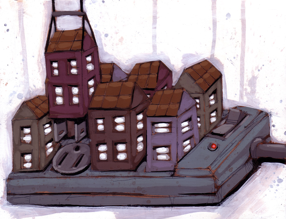
Garage Door Opener


I created the "Garage Door Opener" over a period of two weeks, but it turned out that I worked the hardest the night before it was due. I spent a good amount of time on the left component of the painting because I was trying to develop the gradient of the gear to allow the audience to focus on that part the most. I found that the right side of the painting was easier because I felt it was easier to make the gradient from black to white instead of intense violet to light pink. My materials were acrylic paint and a sharpie pen. The sharpie pen was used to thinly outline certain areas of the painting, such as the tube at the top left corner and some of the nobs in the bottom left corner. The dimensions of the painting are twelve inches by nine inches. I had trouble with making the painting balanced. I was not sure how to add violent to the right side of the painting. Initially the violet button on the right side was red but after further thought it was changed to violet because it made the painting look like two separate pieces. I also struggled with deciding whether or not to continue the line going down the center of the painting. This was an issue because if I finished the line the painting would look like two separate pieces and if I did not finish the line, the painting would look unfinished. I solved the problem by continuing the line half way through so that the two parts of the painting look connected though separate. I feel that I was successful in creating a gradient and that overall I was precise. From this project I learned that I should have a detailed plan of what I was going to paint each day instead of procrastinating.

Tuesday, February 1, 2011

Fresh Art

I don't really know this artist and thanks to Mr.Spradley, stumple upon helped me find Ric Stultz. I usually don't care for this kind of art, but the paintings are clever. Check it out!

http://www.stumbleupon.com/su/4ZNw0F/www.ricstultz.com/